REBRAND AND WEBSITE REDESIGN BRISTOL
Rebranding and website redesign were at the forefront of our work with The Lagom Clinic, a private GP practice in Bristol. They approached us to revitalise their brand identity and online presence. Our efforts included creating a modernised brand identity, crafting a detailed brand guidelines document, and delivering a fully redesigned, user-friendly website tailored to their needs.
- Client: The Lagom Clinic
- Sector: Healthcare
- Location: Bristol
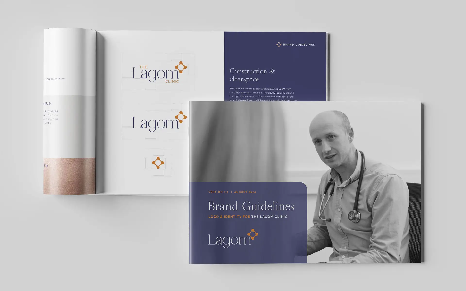
We designed a comprehensive 28 page brand guidelines document. The guidelines covers everything from logo and colour usage, typography and font selection and best practice.
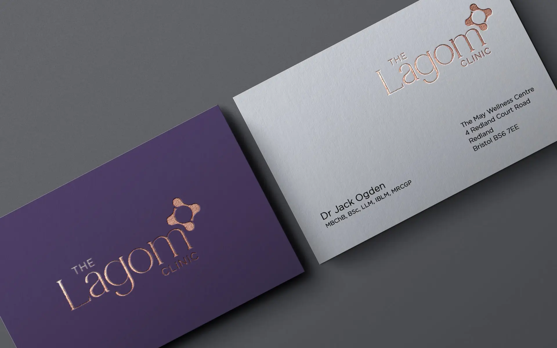
Lagom is a Swedish word meaning ‘just the right amount’ or ‘not too much, not too little’. The logo for this brand identity is inspired by the mathematical symbols for greater than (>) and less than (<). These symbols intersect and counterbalance each other, symbolizing a harmonious equilibrium of “no more and no less.” It also alludes to anatomical joints and DNA structures, highlighting a connection to both precision and the essence of life.
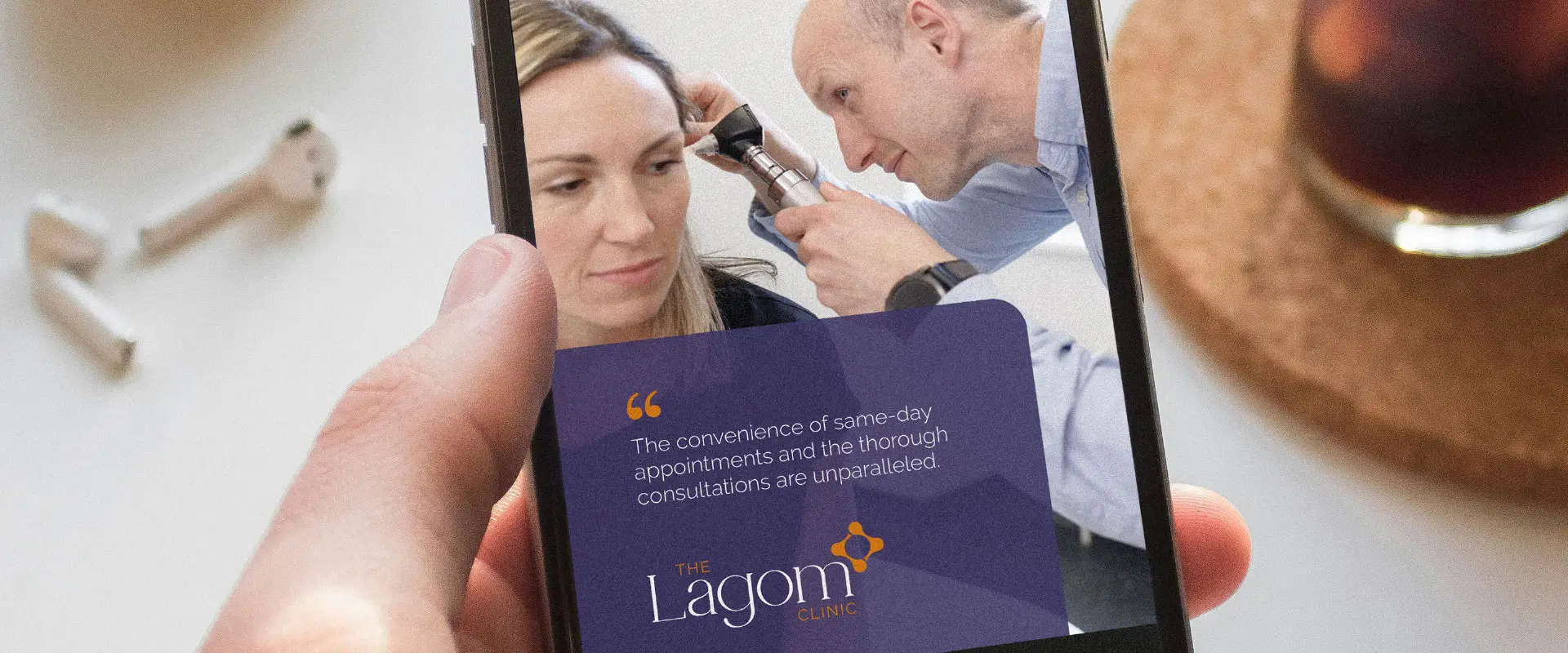
The custom website was designed and developed in WordPress with various features including, Semble online booking integration and Meta Pixel API. More than a brochure website, users can choose from date and time to book their appointment with their preferred GP.