We were enlisted by PrimeSys, a recently established IT specialist company, to conceptualise and develop a fresh brand identity system along with a website.
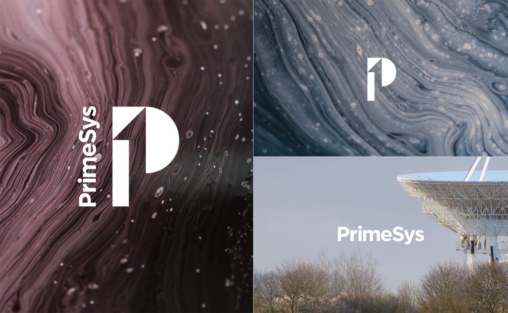

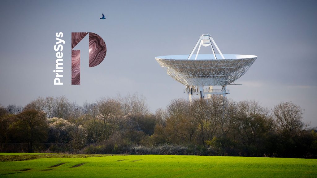

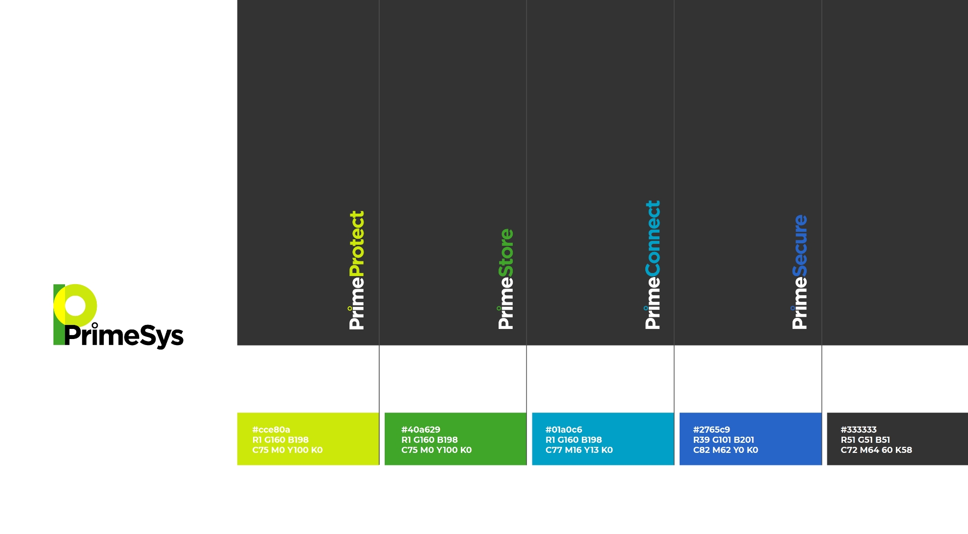
Based on the idea of the first importance; demanding the fullest consideration. First in order of time, existence, or development; earliest; primitive. Using a numeral “1” in the negative space of the “P” of PrimeSys creates a strong icon, simple and elegant using basic geometric shapes, sybolising “simplifying the complexity of IT systems.”

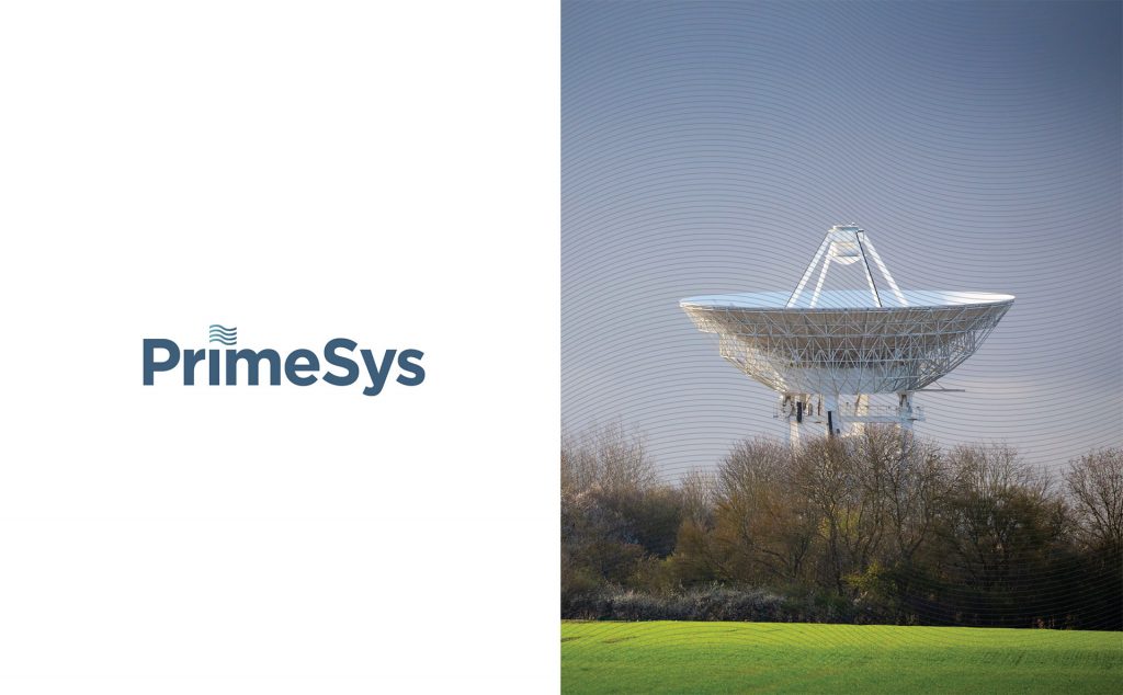
Based on the idea of being first or the best (Prime). Erecting a flag on the moon or on a mountain peak to mark getting there first, prime position. Also depicts being fluid and flexible to a clients’ needs and being agile and adaptive to custom solutions.
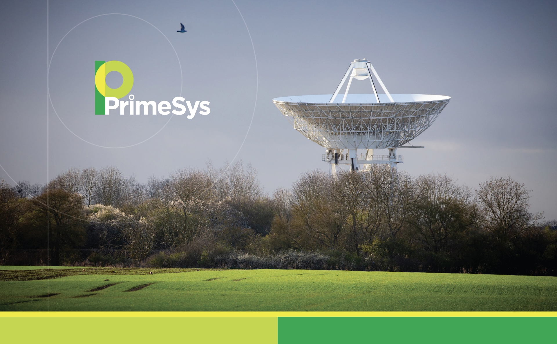
Based on the idea digital signals; 1’s and 0’s. Using a 1 and 0 to create the “P” icon. The dot of the “i” has been changed to mimic the icon to give consistency and brand recognition when used as separate elements.
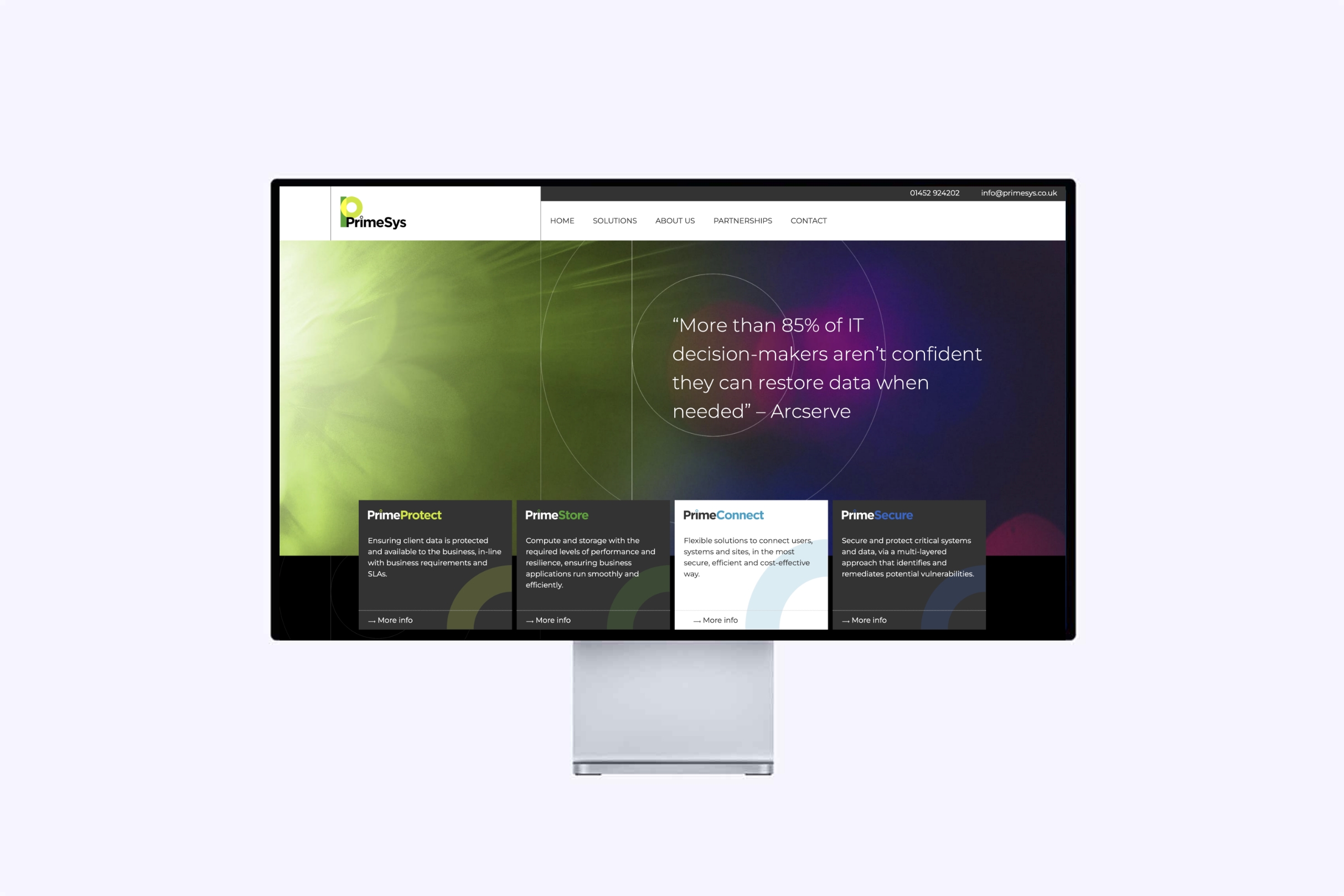
The website was a bespoke build using WordPress. Features include Zendesk integration for tracking downloads and lead generation.

We’ll have an open chat about what drives you, your business and your clients. We’ll gain insights and advise you on how we can help you propel your brand into the future.
Schedule your free discovery call
Alternatively you can call us on 01453 298083
or email studio@five-fifty.com